
As part of my game character creation project I created a male character as seen below. I thought it'd be cool to have one of the characters wearing a skateboard as part of their dress, for use later on as part of what ever task they were going to do.

This the design for the skateboard deck's underside, at the back of that character above.

I'd seen lots of skateboard painting and designs on http://www.ffffound.com and I wanted to do a cool one for this character. One's like

This one above is designed by McBess who is this illustrator,director and animator (I think) http://mcbess.com/


Also there seem to be a lot of laser carved skateboard design that are really crisply done.


I did consider trying to replicate somethings a bit like the artwork of Lois Van Baarle after seeing a couple of designs like this.

Lois Van Baarle does a lot of illustrations with quite curvy shaped objects and characters and a colour palette that looks a bit like a cross developed photograph (http://loish.net/) .

We went to stay at a friends house and one of his tenants has lots of prints from Audrey Kawasaki. I quite liked the wood texture with the pencil and ink and I thought that if I scuffed up that skateboard a bit at the edges, to make it look like its been used; I could try and include a bit of the wooden texture and get that 'Audrey Kawasaki Effect'. www.audrey-kawasaki.com

I wanted the skateboard design to be something a bit orientally to go with the mask the male character was wearing around his neck.I wanted the skateboard design to be kind of like a Willow Pattern type of thing even. In the end here I tried to make it look like the woman was pouring water out of a kettle and a carp fish has magicked out of the water,jumping up from where the water is splashing.

I'm not sure who did the graphic for them but they remind me a bit of the type of illustration Pac23 does (http://32cap.blogspot.com/) or the type of illustration you see on the tokidoki (http://tokidoki.it/). I like the solid outlines that define the outside of the character and the edges of the different items of clothing, whilst the details on the clothing have no defining black lines around their edges. I sketched out the characters by eye from the window, well as the fish, petals and water that I talk about later on and then drew them out as vectors from the photograph using the pen tool within Photoshop, so that I could easily rescale and place them in the design.

In the skateboard design I tried to work this negative space in underneath the woman pouring the kettle. The background of the lower part of the skateboard is black, leading down from the outline of the woman, making the white leaping fish stand out more.

The surf, bubbles and swishing water that the fish is jumping out of, I tried to make look like clouds or
dashing water do oriental paintings and pictures. In Tiananmen Square, before you go into the forbidden city, I saw these stone totem poles with all this curly cloud carved into them at their top.
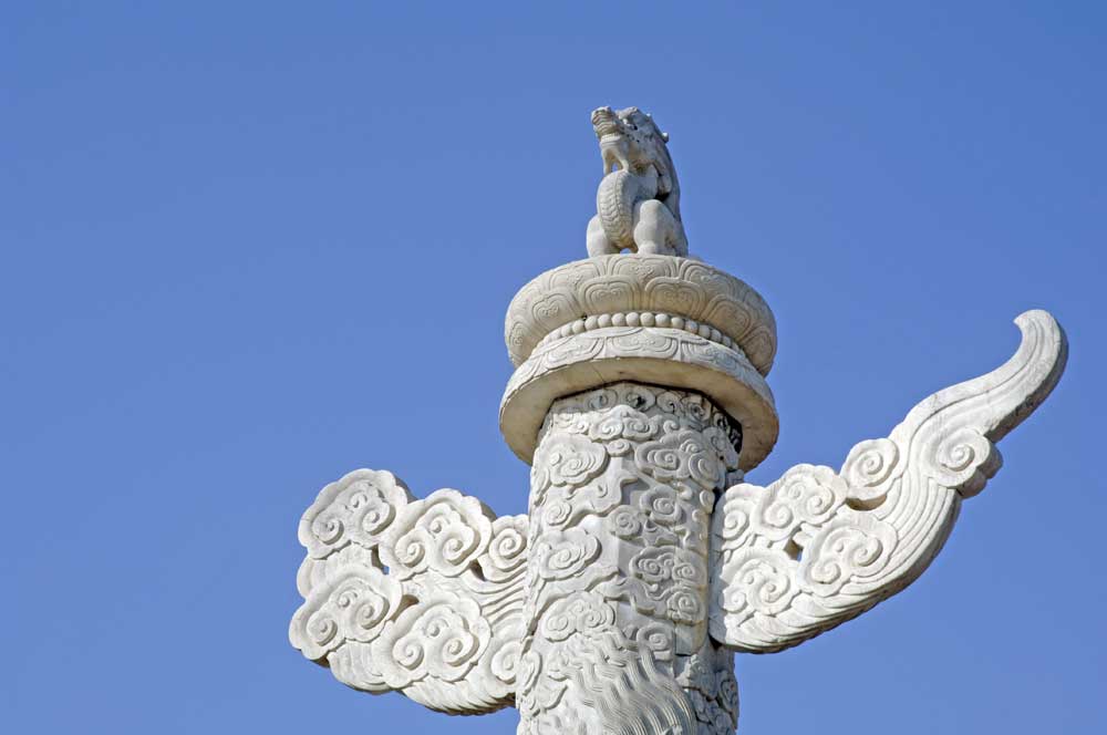
I had a long time to look at them because the line into the forbidden city was slow moving and they kind of reminded me of the design on the Beijing Olympics torch.

I looked at the different coy carp tattoo designs for the fish and settled on one I like the look of. Then I drew in the swooshing water as though it was gushing round the shape at the bottom of the skateboard.

No comments:
Post a Comment